The concept of breadth is pretty simple: the more stocks that participate in a trend, the stronger that trend is. All 3 major stock indexes in the United States set new weekly highs, but how strong is the trend?
The cumulative advance-decline line might be the most well-known breadth indicator. The calculation is easily understood (the difference between rising issues and falling issues at the close is added to the previous day’s value), and it has reliably diverged before many of the largest bear markets. It’s a good place to start for a market breadth review. Right now, advance-decline is signaling the all clear – as the indexes have set new highs, so has the cumulative A/D line.
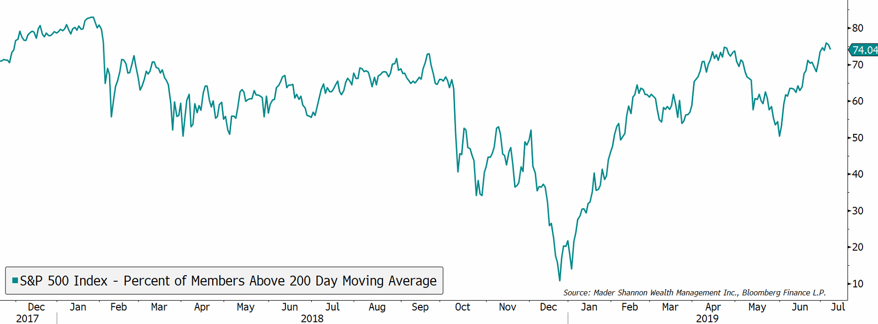
The percent of stocks above their 200-day moving average is healthy, too. Moving averages are, by definition, lagging indicators, and recent studies have cast doubt around their reliability as trading signals, but I find them useful as a litmus test. When an issue trades above a moving average, it’s hard to argue that it’s in a downtrend (and vice versa). Right now, 74% of stocks are above their long-term moving average. That’s just as good as anything we’ve seen since the January 2018 peak.
The number of stocks setting new highs and new lows is somewhat weaker. As the market has rallied over the past month, the New Highs index has set a string of lower highs. This divergence is a cause for concern, but divergences are not meaningful unless they’re confirmed by a price reversal. A larger red flag will be raised if we start to see an expansion in new lows accompany the decline in new highs.
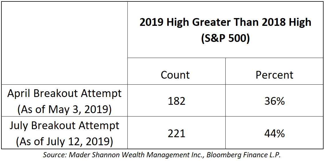
The measures above are some of the most common ways to look at breadth, but it’s also important to account for the current environment. Stocks have struggled to gain traction since the run-up that ended in January 2018. They tried to break higher last October, but failed in dramatic fashion and fell 20% by Christmas Eve. When the S&P 500 rallied and first exceeded its 2018 highs in April of this year, only 182 of the 505 members had done the same – a 7% correction followed. As of this writing, 221 members have exceeded their 2018 highs at some point this year – a significant improvement, but still less than half. Those readings are somewhat comparable to the latter half of 2016, when the first breakout attempt (September 2016) had only 39% participation and resulted in failure, but the successful second attempt (November 2016) had 50% participation.
The picture deteriorates somewhat when you look at current prices. Only 177 constituents (35%) are currently trading above the 2018 resistance. Additionally, Utilities and Real Estate are the only positive sectors, with all but 16 of their combined 60 members trading above 2018 peaks. The majority of stocks in each of the other 8 sectors are beneath those key levels.
Put simply, broad swaths of the market are still stuck below resistance – the median stock in the S&P 500 is 7.5% below its 2018 high. Participation could clearly be better, but it’s less clear whether it’s weak enough to necessitate another correction. Markets are regularly led by a few strong names, and they can drive prices higher for longer than anyone expects. One thing I’m sure of: a broadening in participation would be extremely healthy for stocks as we move forward, but the cyclical sectors have some work to do.
Nothing in this post or on this site is intended as a recommendation or an offer to buy or sell securities. Posts are meant for informational and entertainment purposes only. I or my affiliates may hold positions in securities mentioned in posts. Please see my Disclosure page for more information.
